BLOG interiors + staging + lifestyle

2 of the New 2024 Paint Colors of the Year
It’s that time of year again - falling acorns, changing leaves and paint companies releasing their Color of the Year and paint palettes for the upcoming year. Let’s take a look at two of the many Colors of the Year, Sherwin Williams and Home Depot’s Behr.
It’s that time of year again - falling acorns, changing leaves and paint companies releasing their Color of the Year and paint palettes for the upcoming year. Let’s take a look at two of the many Colors of the Year, Sherwin Williams and Home Depot’s Behr.
Sherwin Williams’ cool coastal color Upward SW-6239
Sherwin Williams Upward is a breezy, peaceful, calm blue hue. According to Sue Wadden, director of color marketing for Sherwin Williams "Upward SW 6239 represents the gentle forward momentum in all of our lives. It brings to life that carefree, sunny day energy that elicits a notion of contentment and peace. With this color, we invite our consumers to take a pause and infuse a new sense of ease and possibility into their spaces – one that doesn't overwhelm, but rather establishes meditation and tranquility."
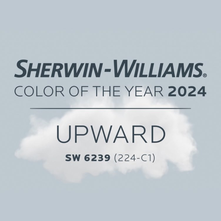
Sherwin Williams Color of the Year 2023 Upwards
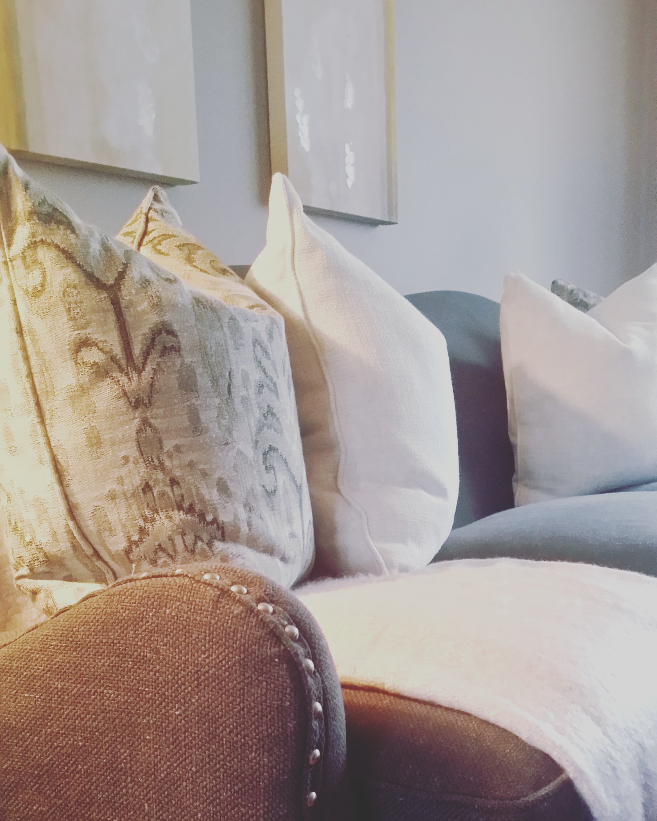
This nice, mid to lighter denimy blue has just a smidge of gray and the same smidge of violet in it, reminiscing for me my periwinkle toned pale blue wedding dress I sported for my nuptials many moons ago. For the rest of you, you’ll think of your most washed, comfy jeans, a clouded blue sky, or channeling the Coastal or Nordic style vibe.
How can you incorporate this color into your home?
Color psychology says that blue is a color often found in nature, such as the pale blue of a daytime sky or the rich dark blue of a deep pool of water. It is for this reason, perhaps, that people often describe the color blue as calm and serene making it a perfect color for places you want to feel calm and serene in - Bedrooms, living rooms, offices.
Too, this color with its touch of violet will pair nicely with natural and oak woodtones, which is a bonus for older homes.
A survey spanning 10 countries found that blue is the most popular "favorite color" for people globally, with men preferring the color blue more often than women (40% versus 24%, respectively, among subjects from the United States) making it a good choice color when staging a home. A pale blue bathroom will add 1.3% to the value of your home according to the Zillow Paint Colors Analysis.
Sherwin Williams recommends pairing the hue with blues and greens, deeps and darks and delicate tints like Sherwin Williams Snowbound SW 7004, Drift of Mist SW 9166, Gale Force SW 7605, Tricorn Black SW 6528, Honeydew SW 6428, Palm Leaf SW 7735 and Antiquarian Brown SW 0045.

Sherwin Williams Upwards Collage
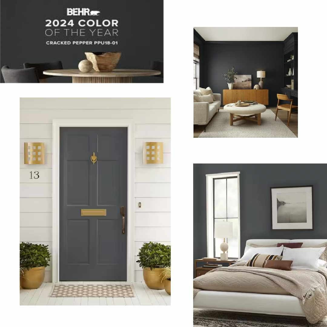
Behr’s moody, sophisticated Cracked Pepper PPU 18-1
The Behr 2024 Color of the Year is Cracked Pepper, a soft black that exudes confidence and instantly elevates any indoor and outdoor space. It is a versatile and sophisticated color that can be paired with various styles, finishes, and accents.

"As we look into 2024, creating a sense of comfort and belonging will continue to drive design decisions—but now, as life returns to its more familiar rhythms, it's time to allow our senses to come alive," says Erika Woelfel, Vice President of Color and Creative Services at Behr Paint Company. "We recognize the growing desire for using darker colors throughout spaces," says Jodi Allen, Global Chief Marketing Officer at Behr Paint Company. "Adding a soft black like Cracked Pepper evokes a sense of confidence and individuality that we want all of our customers to feel after completing a project."
This edgy, deep gray black with blue undertones reminds channels for me the whole Dark Academia vibe we have seen the past few years. I’m itching to paint my living room TV/media wall back wall this color. For the rest of you, you’ll think pencil graphite, the perfect color winter cashmere sweater, or channeling anything Ralph Lauren home to minimalistic Contemporary style vibe.
How can you incorporate this color into your home?
According to Behr, more than half of Americans (54%) say black tones in a home create a new energy and vibe, so anywhere.
When selling Buyers are saying goodbye to bland and bidding more on homes with dusky, dramatic walls. A new Zillow® 2023 study finds recent and prospective home buyers would offer more money for a home with interiors painted dark gray. Charcoal walls are associated with higher offer prices than white in every room studied: kitchen, living room, bathroom and bedroom.
Quiet Luxury, a term borrowed from the fashion world, refers to the understated elegance of classic cuts and quality fabrics over the brashness of logo-mania. Thanks to its dramatic and moody feel, Cracked Pepper is the perfect way to bring this aesthetic to your home. For polished results, Behr recommends pairing it with warm neutrals, such as Chic Taupe N230-4 , a hue that’s the perfect balance of brown and gray.
Thanks to its earthy, organic undertones, Cracked Pepper is also a great exterior paint. It’s a decidedly modern hue when splashed across the whole house, but paired with red brick, it leans more traditional. For a small project with a big payoff, try painting your front door and shutters.
Behr’s 2024 Cracked Pepper Collage
Want to find out more about who and how these paint colors are picked each year, more details on how to use new color trends whether selling or dwelling?
Tune in tomorrow (Wednesday 10/11/23) for the launch of my new Home Staging Podcast ONLY STAGERS IN THE BUILDING. I’ll be joined with Mary Hoffman paint and color expert from Benjamin Moore.

Survey Says! 2021 Home Colors When Selling
A recent Zillow survey reveals which colors may attract more prospective buyers — and higher offers — when you're getting ready to sell.

A recent Zillow survey reveals which colors may attract more prospective buyers — and higher offers — when you're getting ready to sell.

Here are my picks :
Light Blue Bathroom Sherwin Williams Sea Salt : Calming, lovely and the perfect combo of blue and green. ( Bonus. With 2022 color trends leaning towards the green palette, this hue bridges both years.
White Kitchen - Benjamin Moore White Dove : Soft, collective, especially if there are wood tones floating about the home. White Dove is a perfect choice for walls, cabinets or trim.
Gray Living Room - Benjamin Moore Edgecomb Gray : A greige color with warm and once again looks good on the walls with wood tones and marries well with furniture that is already in the home.
Dark Blue Primary Bedroom - Sherwin Williams Naval : A recent color of the year for Sherwin Williams. Besides looks great in a bedroom, and if you want to play it safe, as an accent wall - this ‘everyone love navy’ color looks stunning as a front door color and can break up an all white kitchen as the island color.

Whether selling or dwelling, my color expertise can help you sell your home and update, refresh and revive your space for 2022. Call or text @ 708.543.8597. - Julea

2015 Paint Trends - Sherwin-Williams
2015 Sherwin Wiliiams Color Forecast
Color forecasts are a great way to get inspired and see what will be trending from accessories to wallpapers. Sherwin Williams who partners with Pottery Barn too, showcases their picks for the upcoming year. At the end of the post, you can click on a link to see the entire palette.
-Enjoy!

As technology rushes relentlessly ahead, the colors of Chrysalis evoke a calm oasis — a place to pause and find balance. The palette, with colors ranging from off-black to chalky neutrals and dusty blues, is designed to create a more comfortable interior.
“An important influence for Chrysalis is the appreciation of earth’s natural striations,” said Jackie Jordan, director of color marketing with Sherwin-Williams. “The patterns created by land and sky are driving design inspiration, therefore the palette’s colors are found in nature, from rocks found on the beach to a stormy sky.”
Another driver is the layering and deconstruction of geometric shapes to appear soft, which parallels the monochromatic couture found on fashion runways.
From space tourism and undersea resorts, the far-fetched, sci-fi dreams of past decades are more viable than ever. The Voyage palette looks to these outer limits, featuring hues that represent the color spectrum imagined while emerging from the water into the atmosphere – undersea teal, bright green kelp, light watery blue and deep space purple.
“The colors of Voyage are supernatural and magical,” Jordan said. “The palette is largely driven by unusual atmospheric events, including a decade-best aurora borealis that will be keeping our eyes focused on the heavens. The lighter colors of the palette create a space that is uplifting, while the deeper tones can be combined for a more dramatic design.”
“We’ve weathered the recession and are finally seeing hopeful signs of growth and expansion,” Jordan said. “Our revived good spirits echo the optimism that followed World War II, when GIs returned home from exotic locales, bringing a wave of tropical prints and tiki-inspired looks. Like that era, we’re expressing our enthusiasm with big, bright florals in fashion and interiors.”
The colors of Buoyant are reminiscent of vintage floral patterns – light and deep greens, violets and a pop of coral. In addition to renewed optimism, the palette is also inspired by the natural healing of botanicals, as well as the incorporation of green spaces into even the most densely urban environments. Backyards, once a landscaping afterthought, are now as important as front yards, with builders investing in rear “curb appeal” and outdoor rooms.
From bold, ethnic-inspired colors and designs to the Bohemian lifestyle, the Unrestrained palette celebrates a carefree spirit, wanderlust and pulsing color. The palette features saturated primary hues, including sunny yellow, lively turquoise and bright blue, as well as black and white. Each can be used on its own for a pop of color, or combined, to create a vibrant, energetic space.
“South Africa’s colorful art scene and focus on the 2016 Summer Olympics in Rio de Janeiro have strongly influenced a Carnival-like spirit,” Jordan said. “This spirit is inspiring design with a zest for life, and the vibrant colors of Unrestrained are a reflection of that design aesthetic.”