BLOG interiors + staging + lifestyle
Spring Displays using a Wired Tiered Basket
Easy Easter and Spring decorating ideas using a Tiered Basket
I encouraged my client Kim to purchase a tiered basket for her Kitchen island to use both as a seasonal display piece, as well as a fruit holder. It's what I call a "Good Bone" accessory. A piece that can be used in multiple ways and can change from utility to display easily. Each season, Kim will asks for ideas. Here are a few ideas for your display Kim.
Photo: Source
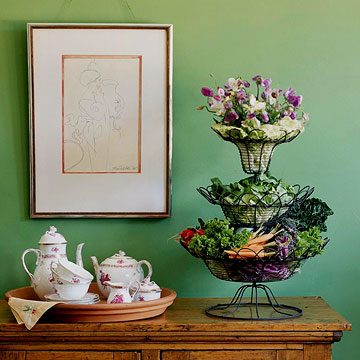
Violas & veggies! Perfect for your Easter Sunday celebration!
Photo: Source
Source wood Easter eggs, add letter stickers, a few colorful Easter related finds - all placed in a nest of grass green basket shreds.
Photo: Source
Peter Rabbit would be very happy to hop up to this basket!
Photo: Source
Faux greenery and flowers create this base with just a few ceramic rabbits and a bow to complete.
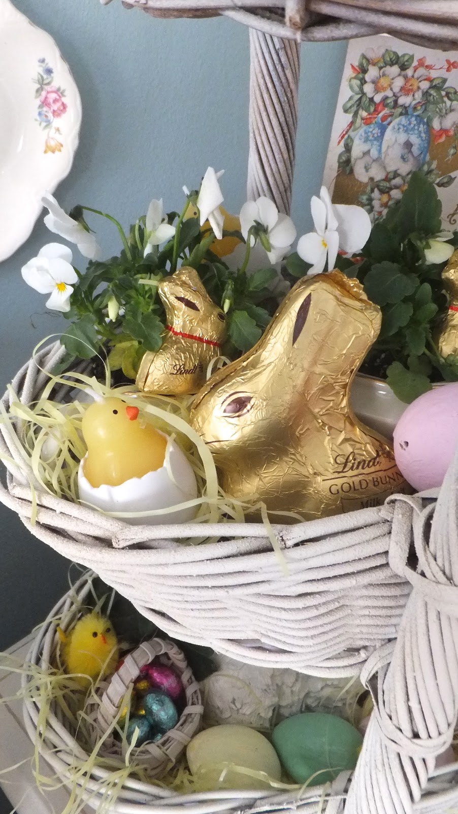
This wicker tiered basket is filled with Easter Basket basics.
Photo: Source
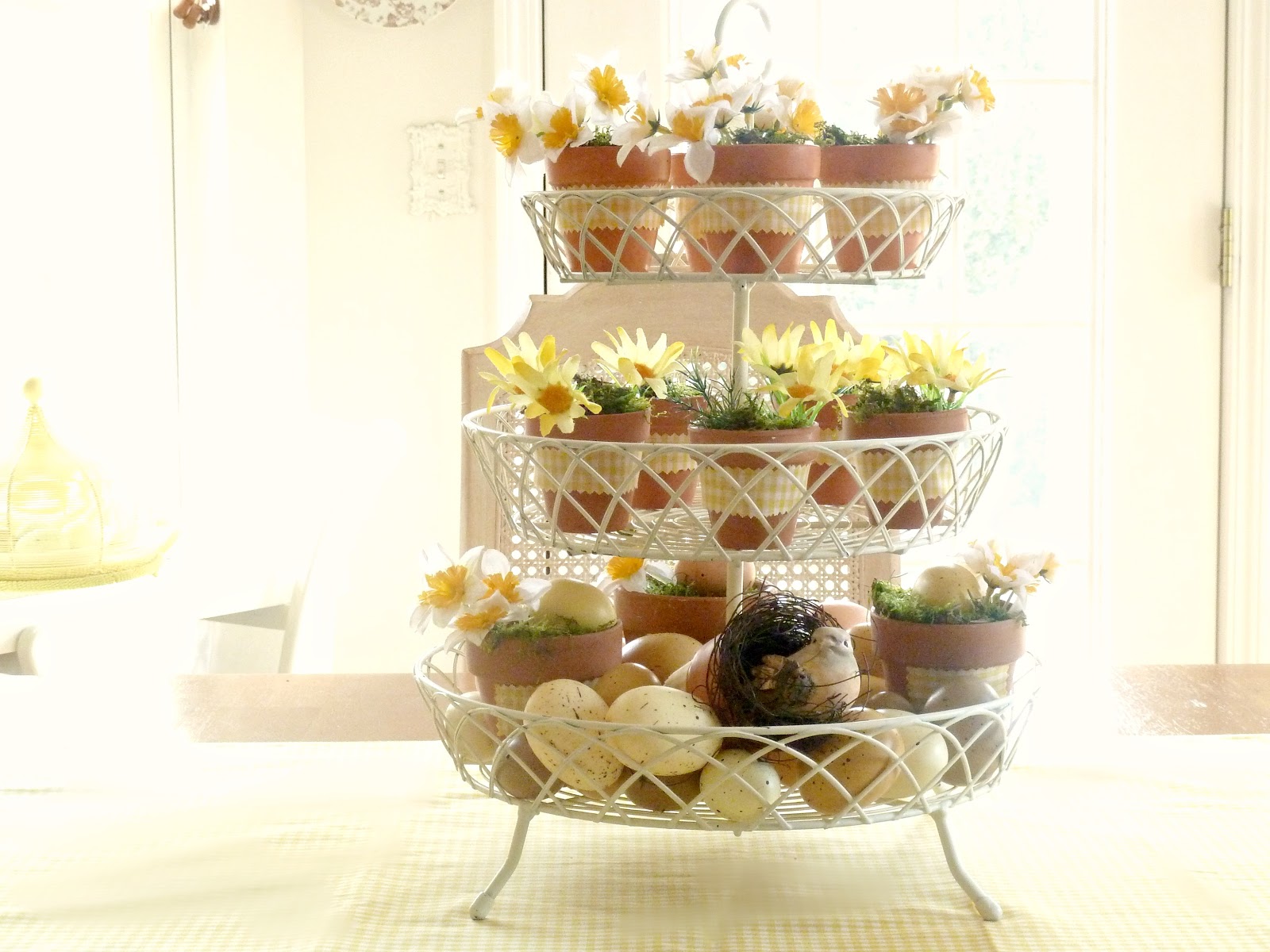
Simple small clay flower pots wrapped in Easter dress gingham, spring blooms and eggs.
Photo: Source
Plaid napkins line these baskets, with kitchen and silk floral finds for a perfect little setting.
2015 Paint Trends - Sherwin-Williams
2015 Sherwin Wiliiams Color Forecast
Color forecasts are a great way to get inspired and see what will be trending from accessories to wallpapers. Sherwin Williams who partners with Pottery Barn too, showcases their picks for the upcoming year. At the end of the post, you can click on a link to see the entire palette.
-Enjoy!
As technology rushes relentlessly ahead, the colors of Chrysalis evoke a calm oasis — a place to pause and find balance. The palette, with colors ranging from off-black to chalky neutrals and dusty blues, is designed to create a more comfortable interior.
“An important influence for Chrysalis is the appreciation of earth’s natural striations,” said Jackie Jordan, director of color marketing with Sherwin-Williams. “The patterns created by land and sky are driving design inspiration, therefore the palette’s colors are found in nature, from rocks found on the beach to a stormy sky.”
Another driver is the layering and deconstruction of geometric shapes to appear soft, which parallels the monochromatic couture found on fashion runways.
From space tourism and undersea resorts, the far-fetched, sci-fi dreams of past decades are more viable than ever. The Voyage palette looks to these outer limits, featuring hues that represent the color spectrum imagined while emerging from the water into the atmosphere – undersea teal, bright green kelp, light watery blue and deep space purple.
“The colors of Voyage are supernatural and magical,” Jordan said. “The palette is largely driven by unusual atmospheric events, including a decade-best aurora borealis that will be keeping our eyes focused on the heavens. The lighter colors of the palette create a space that is uplifting, while the deeper tones can be combined for a more dramatic design.”
“We’ve weathered the recession and are finally seeing hopeful signs of growth and expansion,” Jordan said. “Our revived good spirits echo the optimism that followed World War II, when GIs returned home from exotic locales, bringing a wave of tropical prints and tiki-inspired looks. Like that era, we’re expressing our enthusiasm with big, bright florals in fashion and interiors.”
The colors of Buoyant are reminiscent of vintage floral patterns – light and deep greens, violets and a pop of coral. In addition to renewed optimism, the palette is also inspired by the natural healing of botanicals, as well as the incorporation of green spaces into even the most densely urban environments. Backyards, once a landscaping afterthought, are now as important as front yards, with builders investing in rear “curb appeal” and outdoor rooms.
From bold, ethnic-inspired colors and designs to the Bohemian lifestyle, the Unrestrained palette celebrates a carefree spirit, wanderlust and pulsing color. The palette features saturated primary hues, including sunny yellow, lively turquoise and bright blue, as well as black and white. Each can be used on its own for a pop of color, or combined, to create a vibrant, energetic space.
“South Africa’s colorful art scene and focus on the 2016 Summer Olympics in Rio de Janeiro have strongly influenced a Carnival-like spirit,” Jordan said. “This spirit is inspiring design with a zest for life, and the vibrant colors of Unrestrained are a reflection of that design aesthetic.”
