BLOG interiors + staging + lifestyle
Decorating Ideas to Refresh your Space While We’re Staying in Place
With home the focus of our daily life right now, it’s a great time to rethink some of our spaces.
With home the focus of our daily life right now, it’s a great time to rethink some of our spaces. Whether re-styling a bookcase, seasonally decorating, up-styling something we already have, or leaping into a bigger project - here are ideas to refresh your space while we’re staying in place.
Paint. -A new color can give a room a fresh look. From spring greens or trending blue hues, paint packs a big punch to giving a space a new view. Most paint stores will let you phone in, order on-line, and offer curbside pickup. From painting an accent wall, up-styling a bookcase by painting the back, or painting a piece of furniture - infusing a new color into a room can really reboot it.
Paint. -A new color can give a room a fresh look
Rearrange. -Spring has arrived! It’s a perfect time to rearrange a room for a new season. Give your space a new perspective with a new furniture arrangement. Perhaps swapping pieces from other rooms. Try switching a chair, a table, art; they’re all good swapping ideas to give a room a different look. Lighten your space by removing heavy rugs to simplify a room. Change the sitting area to a new focus from the fireplace view to taking in the nature from the view out the window. By giving your space a new perspective, it gives you one too.
“Give your space a new perspective with a new furniture arrangement. By giving your space a new perspective, it gives you one too.”
Pull out that Sewing Machine. - If you have forgotten how to use it, YouTube has hundreds of instructional videos on how to sew and use your machine. Sew up a new pillow cover, table runner, or add contrasting fabric trim to a ready made window panel on the edge, top or bottom. Re-purpose table clothes, napkins or tea towels into usable yardage. Fabric can too transform a lampshade, or cover an ottoman.
Pull out that Sewing Machine.
Discover Your Styling Skills. After you’ve painted the back of your bookshelves, you’ll need to fill it back up. Refill it with accents from other spaces, organize your books by color, or even recover them with bright papers. Small art that was lonely hanging on a wall, can find a new home on the bookcase back, or perching on an easel decorating a favorite table. Style an entry table with accessory, or seasonal odds and ends to tell a story - books are great to add height, color and interest to a vignette.
Discover Your Styling Skills.
Need additional inspiration or help with styling and decorating? We now offer consultation remotely.
-Julea
RESOURCES
https://www.acehardware.com/onlineorder
https://jclicht.com/jc-licht-open-coronavirus-response/
https://www.sherwin-williams.com/homeowners/special-offers
https://www.lowes.com/l/store-pickup.html
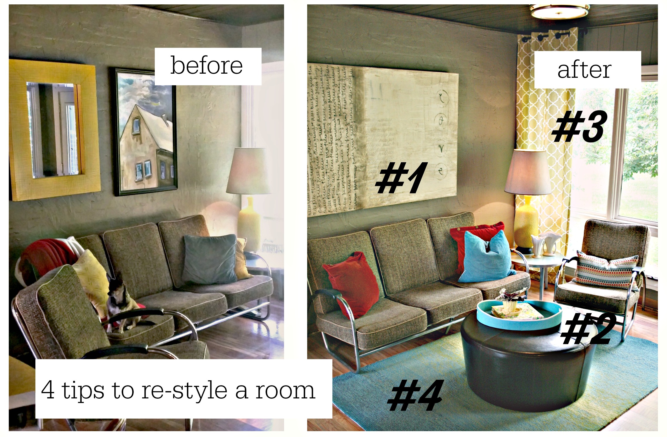
4 Fall Re-Style Tips for HOME
A fall home decorating refresher is the perfect remedy for your home’s style malaise. I offer 4 tips in this post to remedy your home’s neglected look.
Mornings are a bit cooler, the kids are back to school, and you look at your calendar and there are only 124 days till Christmas! Summer takes its toll on your home interiors. Perhaps you have piles of papers in the dining room, a spooky dust covered living room, and the family room’s pillows have been over loved by both the kids and your dog.
A fall home decorating refresher is the perfect remedy for your home’s style malaise. It’s time to add a new furniture arrangement, an accessory shake-up, and some strategic power shopping to put a bit of zing into your home spaces.
So where to start? I offer 4 tips in this post to remedy your home’s neglected look.
#1 Assess your Stuff. Take a hard look at your stuff. Move room to room and look at your furnishings, lamps, accessories and art. Could some of these pieces be swapped to another room, be reinvented, repurposed or removed?
- In our example, a large painting from the living room was swapped. The scale, colors and style looked great over the couch.
#2 A New Position. As the seasons change, so should your room's arrangements. Fireplaces in the summer - who cares; but as the cooler weather creeps in, you'll want to soon be curled up next to your fireplace with a cup of hot coffee and a cozy throw. A mantle refresher will give new life to your fireplace and a new furniture arrangement will give you a fresh perspective and a new view whether your room's emphasis is a fireplace, TV or just to create a new seating for conversation.
- In our example, a new position for the chair, and an added ottoman from another room creates a new arrangement for the space. The brown ottoman pulls the color down from the paneled ceiling and provides a place to put up your feet.
#3 Tactile Textiles. Nothing give a space a new style than textiles. A pop of a new color in new drapery panels, pillows, or a throw will instantly up a room's WOW rating.
- In our example, we did some strategic power shopping at Tuesday Morning and added colorful drapery panels and just in for fall, seasonal hued pillows to give the space an update.
#4 Accent with Accessories. Whether you shop your own home, or pick up something new, accessories will refine and finish a space.
- In our example we added a new rug to add that cozy layer for cooler days. The fun ombre indoor/outdoor rug from RugStudio was selected on-line. The vintage vases, tray and books were shopped from other areas of the home, and finish the room's new look.
If you don’t have the time, talent or energy, our team at Reinventing Space will be happy to inject a bit of decorating Botox into your tired home with our FALL HOME MAKEOVER SPECIAL. Call 708-448-7500.
Spring Displays using a Wired Tiered Basket
Easy Easter and Spring decorating ideas using a Tiered Basket
I encouraged my client Kim to purchase a tiered basket for her Kitchen island to use both as a seasonal display piece, as well as a fruit holder. It's what I call a "Good Bone" accessory. A piece that can be used in multiple ways and can change from utility to display easily. Each season, Kim will asks for ideas. Here are a few ideas for your display Kim.
Photo: Source
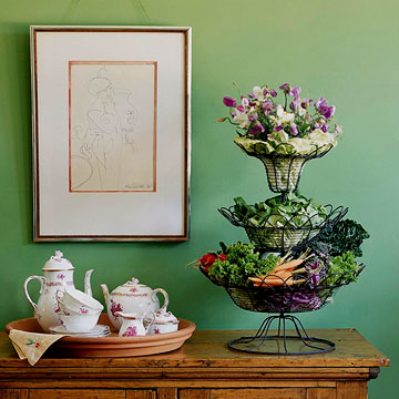
Violas & veggies! Perfect for your Easter Sunday celebration!
Photo: Source
Source wood Easter eggs, add letter stickers, a few colorful Easter related finds - all placed in a nest of grass green basket shreds.
Photo: Source
Peter Rabbit would be very happy to hop up to this basket!
Photo: Source
Faux greenery and flowers create this base with just a few ceramic rabbits and a bow to complete.
This wicker tiered basket is filled with Easter Basket basics.
Photo: Source
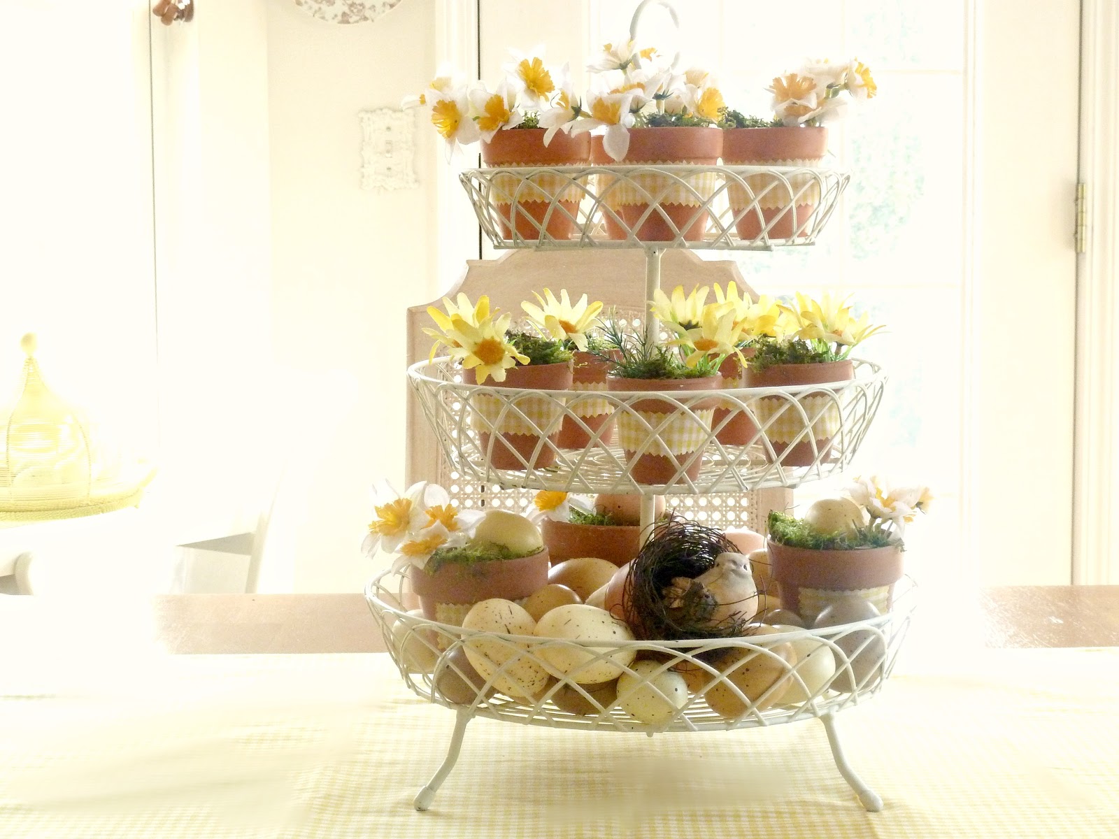
Simple small clay flower pots wrapped in Easter dress gingham, spring blooms and eggs.
Photo: Source
Plaid napkins line these baskets, with kitchen and silk floral finds for a perfect little setting.
2015 Fresh Colors in Home Design - That 70's Shade, ORANGE!
Old orange is fresh and new again.
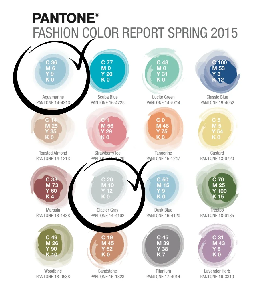
I posted on my Facebook page the other day Elle DECOR's take on PANATONE's Spring 2015 Colors. One of the colors in the mix is an orange, Tangerine, 15-1247.
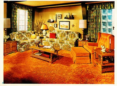
A friend responded with -" Having lived thru the 70's and seeing my mother in law's orange shag in the 'rec room' I never want to see anything remotely tangerine again."
70's Orange Shag Carpet Contempt
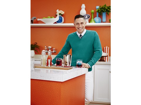
One would guess seeing acres of orange carpet, especially while visiting your mother-in-law would result in contempt for the color. But I would encourage my friend and everyone to find a renewed joy in this fantastic hue; it seems to be trending in home design everywhere. According to Chicago Tribune Real Estate columnist Mary Umberger, who just returned from the 2015 Kitchen and Bath Industry Show in Las Vegas "...orange is hot again, judging from the numerous kitchen displays that showed either accents of bright orange or whole slabs of the stuff." Counter top company, Formica Corporation enlisted iconic designer Jonathan Adler to create a new line for them, which just won a BEST of KBIS. His orange does not look like the Brady's kitchen.
Jonathan Alder for Formica Corporation
Orange in Living Room Photo (Source)
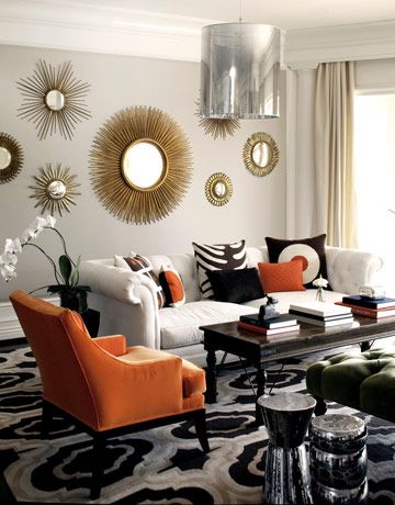
Orange is a bold color for most, so maybe taken in smaller doses. Beside dipping into it in your kitchen, why not try some orange in the rest of home's spaces with accents? Throw pillows, lamps or vases are easy choices since they are small and can add just a hint. Move on up to an area rug with a bit of the hue to create an anchor to a new palette, or take a bolder step into a statement making accent chair.
Anyway you slice it, that old 70's orange seems to be back! Maybe it will replace Black?
1. Ikat Rug - Shades of Light
2. Hot Dog Happy Pillows - Naked Decor at Wayfair.com
3. Alpaca Throw - Crate & Barrel
4. Mr. Smith Chair - Haute House at Horchow
5. Linhas Dinnerware - Anthropologie
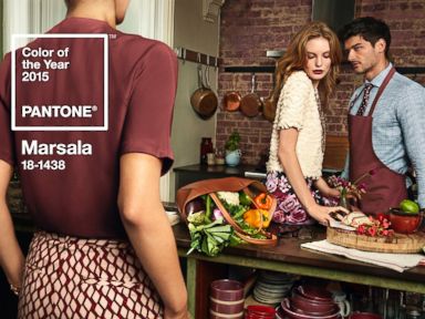
There's Something About Marsala - PANTONE's 2015 Color of the Year
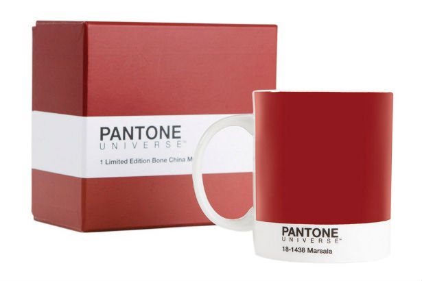
PANTONE 18-1438 Marsala is a daringly inviting tone that nurtures; exuding confidence and stability while feeding the body, mind and soul.
PANTONE Marsala (Photo gallery selections: Source)
PANTONE the leading authority on color has announced their color of the year. For most, you know PANTONE by seeing the PANTONE 'color and paint' display at home improvement store Lowes. But for design insiders they are the guru's of color marketing trends - From fashion and makeup to autos and appliances, their color collections are what we see transformed into new products all over the world.
PANTONE Color Studio
So this year they selected a mellow, red/brown color "Marsala". They say: “PANTONE 18-1438 Marsala is a daringly inviting tone that nurtures; exuding confidence and stability while feeding the body, mind and soul. Much like the fortified wine that gives Marsala its name, this robust shade incorporates the warmth and richness of a tastefully fulfilling meal, while its grounding red-brown roots point to a sophisticated, natural earthiness" I like it! There's something exciting and a bit daring about the color and such a refresh change. We've already seen it in high end fashion, but could we incorporate into our home interiors?
Marsala Color of the Year PANTONE - Fashion (Photo: Source)
Sure, it's the color of brick, wood tones or a rich berry paint color. So if you want to warm it up or add a bit of spice to a space - incorporate away. If you like a more neutral backdrop, try pairing the color with cooler tones, for juxtapose pairing of warm and cool.
Marsala can be translated into Home Decor options.
PANTONE also said to pair Marsala with two other 2015 trend colors - Aquamarine and Glacier Grey. Both of these colors have a strong presence already in home decor and perhaps already in your home. Why not add a pop up your place with easy purchased pillows, a rug or accent accessories to add a bit of Marsala to your mix?
SPRING 2015 PANTONE COLOR TRENDS
Looking to step up for more Marsala? It could be a option for creating a statement in a space. perhaps a piece of furniture, bold window treatments, or a wallpapered accent wall. Consider this new trend color and I think you too will see - there's something about Marsala.
Hooker Furniture - Bombay Chest (Photo: Hooker Furniture)
Marsala toned fabrics and textiles by Ralph Lauren (Photo: Source)
Home Decorating Tips - The Art of the Mix
Wouldn't it be pure bliss to have an unlimited budget to make your home lovely. No regard for the bottom line or being reduced to look at price tags? Oh joy. As a Chicago home decorator, interior stylist and stager there is no fun in that scenario!
I love the thrill of the hunt, find euphoria in using what you already have and get giddy using my creativity and cunning ability to reach the same end. Now that's pure bliss.
My job with clients is to know when to spend it and when not to - getting that right mix. A beautiful home should have a rich collectiveness - A mix of rich with poor, old with new - A recipe that in the end defines the legacy and personality of the homeowner. My business signature is using what you have, and then moving on from that. For most of my clients, shopping is not an issue, nor is what they already own - It's the mêlée of pulling it collectively together to distinguish their space and define their style. Whether they're puzzled on how to make their living room inviting or launching into a remodeling project - Most struggle with knowing how to mix that perfect recipe.
My secret formula is to know when to use it, when to spend it, and how to get the look for less. The total package has to fit together with your personal taste, style of your home and most importantly - Your Budget! It doesn't matter if I'm staging your home, helping you decorate for a party or holiday, or consulting on a major renovation - The formula is the same.
So what's my formula? How you obtain that perfect recipe? Here are the three ingredients:
USE IT: Most of us over the years have accumulated things, whether bought, inherited, or found, we have stuff. If you take a hard look at your stuff; I guarantee there is treasure galore within your inventory. Can you repaint, reupholster, and update it? In another room, would it look better or have better use? Your old stuff is your legacy, it defines who you are, and if it doesn't, I'll let you know. As an educated professional, my talent is to be able to identify what can be used or not when it comes to making your spaces beautiful. Although, most would not cast me to appear on "Antiques Road Show," I'm pretty good at knowing what's worthy, and really good at using it if it fits into the grand plan.
Whether it's a couch, painting or lamp, I'll let you know if it will work, or if it's an undiscovered treasure that we can use "as is," or is worthy of a reinvention. I did a staging recently and came upon a signed Leroy Neiman print that the homeowner had picked up at a garage sale. They were going to toss it because the matting was ragged and damaged and the print was falling out of its frame. After a quick look over and a suggested run to a framing store for a re-mat & tune-up - They'll have a pretty snazzy "real" piece of showcase art!
SPEND IT: O.K., even though I'm supposed to be the budget decorator, sometimes you have to spend a bit. Love that vintage French one-of-a-kind-kind piece, knowing it will be perfect for your awkwardly sized foyer- Entry Table. Go get it! It will become the showcase to your home. You'll love looking at it every day and it will define the style of your place. There has to be expensive in the mix - and there will be a times that spending the big bucks is a worthwhile or part of the grand plan. That stuff may be pricey, but you can fill in the blanks with less expensive or fabulous finds.
The other piece of SPEND IT has to do with the quality of things. Sometimes you can't get it for less; sometimes the workmanship upstages the price point. Your inherited Grandma's dining room set may need repair and is a perfect example of the SPEND IT choice you make. Pair her set with off-the-rack Target window treatments and rods and her set is reduced to a "tired pass-down." Pair her set with custom one-of-kind window treatments and the set is now upgraded to "antique heirloom."
LOOK FOR LESS: Getting the LOOK FOR LESS is a two- fold feat. The 1st feat is to see if you can find the expensive, SPEND IT item for less (you still have to pay a bit of cash.) And the 2nd feat is to have the knack for eyeing that inexpensive item that has the look of expensive. Shopping expensive is easy; anyone can walk into the Chicago Designer Mart and find fabulous stuff, expensively priced. Finding its identical twin or a knock-off for a fraction of the price takes talent and an eye. Getting that look for less, filling in those blanks, makes for that perfect "mix."
Say you've got a few lovely Sterling silver pieces. Pair those with a few more you have found at a discount retailer in silver-plate and the plate becomes instantly "Sterling" by association.
The end result is a beautiful home that has the perfect mix...


